For the last couple of weeks, I had created maps with data overlays:
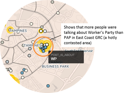
- Instagram map of Singapore General Election 2015
Plots Instagram posts over electoral boundaries (See GE 2015 Instagram Posts Map) - Cluster Map of Customers
Plots & clusters individual customer locations to show concentration of customers in an area
I thought they were kind of cool. After all, I made those maps! Out of scraped data! With an automated tool (R, a programming language, is great for data scraping and stats work)!
And therein lied the problem: I fell in love with what I was doing without answering the all-important question
“So What?”
(from 3 Important Questions. Easy to give advice, harder to follow it)
I was stumped, indignant, and ashamed. I knew data on maps was useful but I couldn’t articulate it. Now with a cooler head, here’s a rundown of possible purposes behind maps with data overlays.
So What Can I Do With Data on a Map?
- Show Concentration & Spread
The most obvious use – we can show how posts and Likes are clustered on top of an area of interest. Going along these lines, we can do the same for prices, traffic etc.
- Track Movement over Time
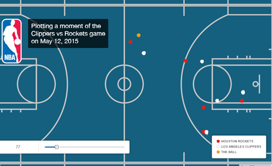
Most geo-located posts have time-stamps. We could map a group of people’s postings over a time period. This could be used to identify user flow. Here’s a really creative visualisation of an NBA game on a map (CartoDB Blog: Displaying NBA Data).

- Show Before & After
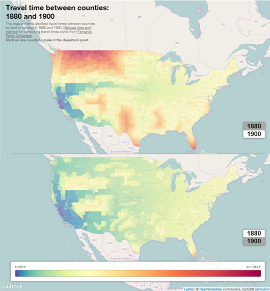
We can divide time-stamped data into categories to show differences between now and then. Like this spiffy map of travel time in the USA in 1880 and 1900 (CartoDB Blog: realtimeliness).

It occurred to me, as I’m writing this post, that there’s actually more that we can do with data points on maps than just the usual cluster and spread.
What’s your use for data on maps?
