A’s friend recently explained my Gallup Strengths* results to me. It was insightful. But more importantly, he mapped my (E) strengths against my partner’s (A) strengths.
It turns out that we’re quite the opposite. She’s very strong in Relationship Building (people-oriented) while mine is a mix of Strategic Thinking and Execution (task-oriented).
I wondered: “To what degree are we different from each other?”
So I built a Same Same But Different Visualisation.
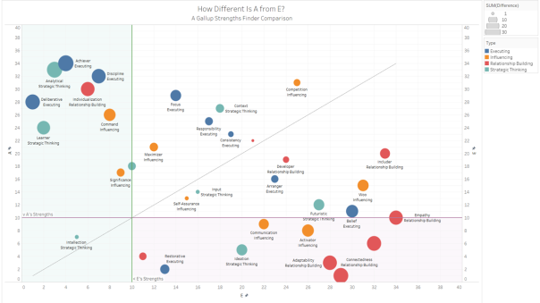
I took the data (essentially a list of ordered pairs of strengths) and turned them into a scatterplot. The circles represent individual strengths. Their location determined by our order pairing. And the size represents the difference in our ordering.
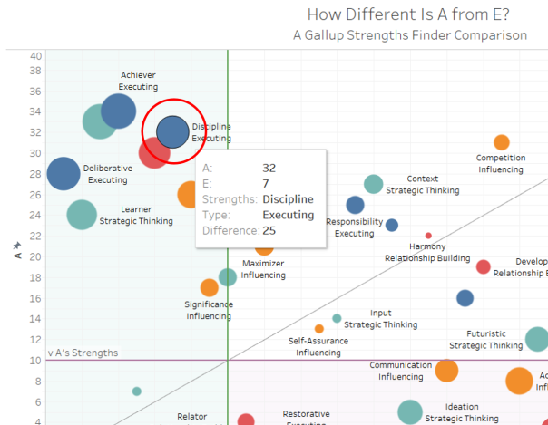
As an example: for Discipline — E is 7, A is 32. The difference is 25. Hence it is located at 32 on A’s axis and 7 on E’s axis. It’s fairly large as it quite close to the maximum possible difference (34 -1 = 33).
For meaningful comparison, I drew a diagonal line (x=y) on the chart. This line shows how far we deviate from having the same strengths. As you can see, there are 6 strengths that are only 15% different (difference of 5) and only one of them — Intellection — overlaps in our mutual strengths. Interestingly, Relator falls just outside E’s strengths but within A’s strengths.

What Does This Same Same But Different Viz Mean?
It highlights the degree of difference for each of our strengths. This shows where we complement each other and where we are lacking.
On the flipside, it also shows similarities that we can build on. In this case, it’s likely Intellection and Relator. The former supposes that we both enjoy thought-provoking debates and the later presumes trust and caring for each other.
At this point in time, this viz lays down “what is…”. I suspect that it can be tweaked to do a little more — what more? I can’t say off the bat. Still too new to Gallup Strengths Finder.
You’re Both So Different. Will It Work?
There is great potential to complement each other. But at the same time there is also great potential for friction. We will see, decide and act through our preferred lenses. Many people have managed this friction with the right mix of tactics.
I’ve done this for myself.
Thinking on it, this visualisation can be used in almost any partnerships. After all, being partners with someone is a little like marrying them.
Download the workbook from my Tableau Profile. You’ll need Tableau 10 or greater to work on it though.
Appreciate any feedback and insights!
* The Gallup Strengths Finder measures your aptitude across 34 attributes. They are categorised into 4 areas: Executing, Influencing, Relationship Building and Strategic Thinking. More at gallupstrengthscenter.com


